
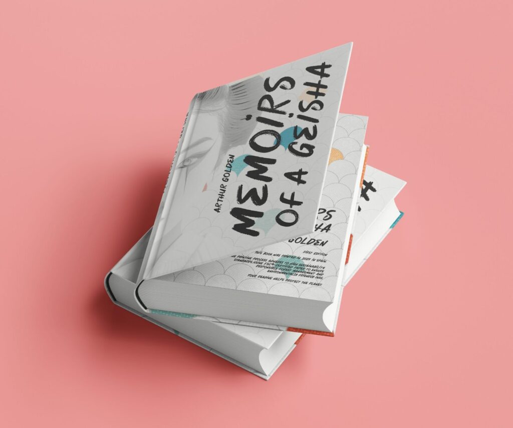
Working on this project was about striking a balance between the cultural essence of the book and a modern, visually appealing approach. Every decision I made has a purpose, and here, I share the creative process behind this design.
From the start, I wanted the cover to captivate with an elegant and contemporary aesthetic. The central image is the face of a geisha, an iconic element that ties directly to the book’s theme. To give it a modern twist, I used a background of traditional Japanese patterns, such as seigaiha (waves), symbolizing harmony and resilience. These patterns are subtly integrated to avoid competing with the main image while adding texture and depth.
The title, Memoirs of a Geisha, is rendered in a handwritten-style font that brings dynamism and personality. It evokes traditional Japanese calligraphy but with a contemporary touch. Its large size and vertical orientation ensure it stands out as a focal point, clearly and memorably. The contrasting colors of black and turquoise create an appealing visual hierarchy, while the author’s name, in a more subdued design, balances the composition without overshadowing the title.
For the back cover, I aimed for a design that balances information with aesthetics. The text is divided into short paragraphs for improved readability, a crucial element for engaging potential readers. I reused the handwritten-style font from the cover, as a sans-serif font would detract from the design’s character. This ensures visual coherence and reinforces the distinctive style of the cover.
Highlighting key words with colors (such as turquoise) and bold text was a deliberate choice to guide readers through the synopsis, emphasizing important elements without overwhelming them. This approach also adds dynamism and strengthens visual contrast.
The background continues the theme of the cover, featuring the wave pattern as a recurring element that reinforces the design’s visual identity and roots it in Japanese tradition. Additionally, the translucent image of the geisha allows the text to remain legible while maintaining a connection to the front cover.
For the spine, my goal was simplicity and readability. The title and author are displayed in the same handwritten font as the cover to maintain consistency. This ensures the book is easily identifiable on a shelf while remaining visually attractive.
The use of turquoise and black was intentional. Black represents elegance and sophistication, while turquoise adds a fresh, modern touch. These colors, combined with the muted tones of the seigaiha pattern, create a harmonious balance that reflects both tradition and modernity.
The composition is carefully balanced to guide the reader’s eye to key elements: first the title, then the central image, and finally the text on the back cover. This flow ensures the design communicates its message clearly and effectively.
If you have a creative project in mind fill the form or send me an email to hola@martapiedra.com

