Client: Penguin Random House
AD: Angie Izquierdo
Illustration & Text: María Dresden
Lettering: Marta Piedra
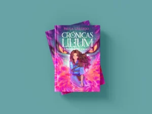
Recently, I had the pleasure of working on an exciting lettering project for Penguin Random House. This commission came from Angie Izquierdo, a designer in the children’s and youth division, who contacted me to create the custom lettering logo for the new María Dresden’s Book.
About the Book
A sweet, fun, and bloody cozy romance starring vampires.
The Commission
This project was an exciting challenge where the lettering had to reflect the central message of the book: letting go of unrealistic expectations for a “happily ever after” and embracing happiness in the present. The goal was to balance the Gothic with the cute, achieving a design that was both evocative and accessible.
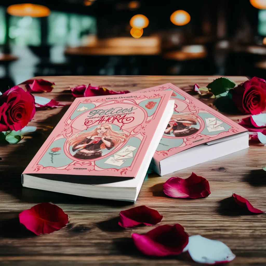
The title structure, with “para siempre” crossed out and “Ahora” overlaid, visually reinforces this idea. The touch of color, with hints of blood, symbolizes intensity and rupture, but I made sure it wasn’t too dark to maintain the adorable aesthetic of the book.
The main challenge was to create a clear and orderly lettering that fit into the available space on the cover illustration, especially above the character. I designed “Happy Forever” in a Gothic-inspired typography, but with a soft touch to make it more friendly, while “Now” was intentionally more expressive, with a bold stroke that draws attention.
The final design not only conveys the tone of the book, but also harmoniously balances the message with the cute aesthetic. This project was a great opportunity to fuse lettering techniques with a deep and powerful concept.
It was important that the placement of the title within the upper space was well-executed in all proposals. The arrangement ensures that the text has a good visual balance with respect to the central character and decorative elements.
The proposals achieved a good balance between Gothic and cute styles, but there were differences in interpretation. For example:
The effect of strikethrough and “Ahora” written with a reminiscence of blood is interesting and effectively conveys the idea without being too terrifying in most proposals.
Legibility is, as I mentioned, the main challenge here. In several proposals, “Felices para siempre” and “Ahora” are easy to read and well-organized. However, some versions have elements that blend together a bit:
The integration of lettering into the port cover frame is accurate in almost all options. The versions that make better use of space have a good balance of visual weight and ensure no uncomfortable gaps.
The lettering successfully combines the Gothic style with a cute touch, particularly with the word “Now” written in a fluid stroke that adds a unique character. The contrast between “Happy Forever” and “Now” works perfectly, highlighting the crossed-out message and adding a rebellious and fresh point.
The strike-through is subtle yet effective. It conveys the concept clearly without overwhelming the composition. The stroke that crosses out “para siempre” maintains a delicate touch, losing none of the general aesthetic, making it more readable and easier to interpret.
The lettering fits harmoniously with the rest of the cover elements. The central placement and decorative frame reinforce the Gothic and romantic aesthetic, without feeling overdone. The integration of illustrations like the rose, garlic, and heart add context and humor, reinforcing the tone of the book.
The color palette, with warm and pastel tones, successfully softens the Gothic style, making it more friendly and charming, ideal for the target audience. This contrast also gives a very distinctive personality to the design.
The flourishes and details around the title and in the frame add elegance without diverting attention from the central text. This balances the Gothic theme with a light and carefree focus, suitable for the tone of the book.