The album cover is the first impression many will have of an album. It’s not just an attractive design; it’s an essential piece of marketing and storytelling that connects with the audience and represents the spirit of the music inside. With the rise of digital platforms, where thousands of options compete for attention, a striking cover can make the difference between being ignored or being heard. Combining visual design and musical context is key to creating memorable covers.
The design process always begins with a detailed meeting with the client. In my experience, defining the concept from the start is essential to reflect the artist’s vision and align expectations. I consider factors such as the musical genre, which can dictate the visual tone (a punk rock band will have a very different style than a jazz soloist). I also explore the client’s references, analyze the target audience, and define formats and specifications. The brief is complemented by a clear timeline to ensure deadlines are met.
In-depth market research and current genre trends are crucial. Creating a moodboard is one of my favorite stages: I select color palettes, lettering styles, visual references, and textures that could represent the album. This board acts as a visual map for the design development, helping to focus and refine the creative direction alongside the client.
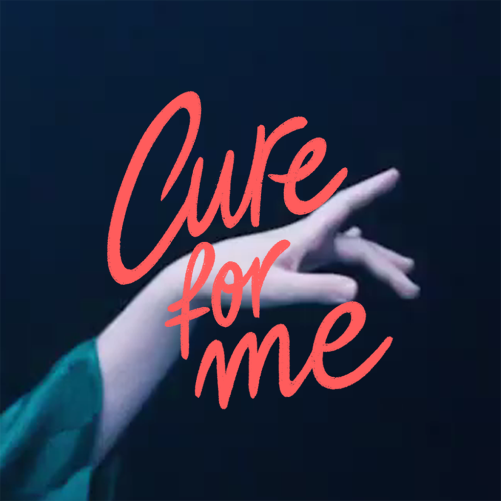
My specialization in custom lettering, illustration, and photography allows me to offer unique proposals. Each typeface is designed to capture the essence of the album, combined with illustrated elements that add character and context. Photography and graphics are integrated to create compositions that convey specific emotions. For example, in a recent project, I used handwritten strokes combined with dark portraits for an alternative folk album, reflecting melancholy and nostalgia.
The design begins on paper, with initial sketches exploring the layout of the elements. Once a concept is approved, I move to digital design using programs like Adobe Illustrator and Photoshop. Here, I play with colors, textures, and details to ensure the cover is visually striking, legible, and consistent. Client feedback is crucial at this stage, ensuring quick adjustments before moving forward.
The final design must be carefully prepared for print. This involves adjusting the design to the CMYK color mode, setting bleed margins, and creating files that meet print requirements. Additionally, I perform readability and visualization tests to ensure the cover looks good both on a large vinyl and in miniature for digital platforms. Technical precision is crucial in this phase.
Covers must also stand out on platforms like Spotify or Apple Music. I consider how they will appear in thumbnails and ensure the composition, colors, and text maintain their legibility and appeal at reduced sizes. Adapting the design for both its digital and physical versions is an integral part of the process to connect with the audience across all possible formats.

If you have a creative project in mind fill the form or send me an email to hola@martapiedra.com

