In bringing this Vi Novell 2024 wine label to life, my journey was a colorful adventure inspired by the fleeting beauty of the season. From the outset, my vision was clear: to capture the essence of this fresh, fruity wine in a way that would resonate deeply.
Crafting each detail was a labor of love aimed at conveying its youthful spirit.
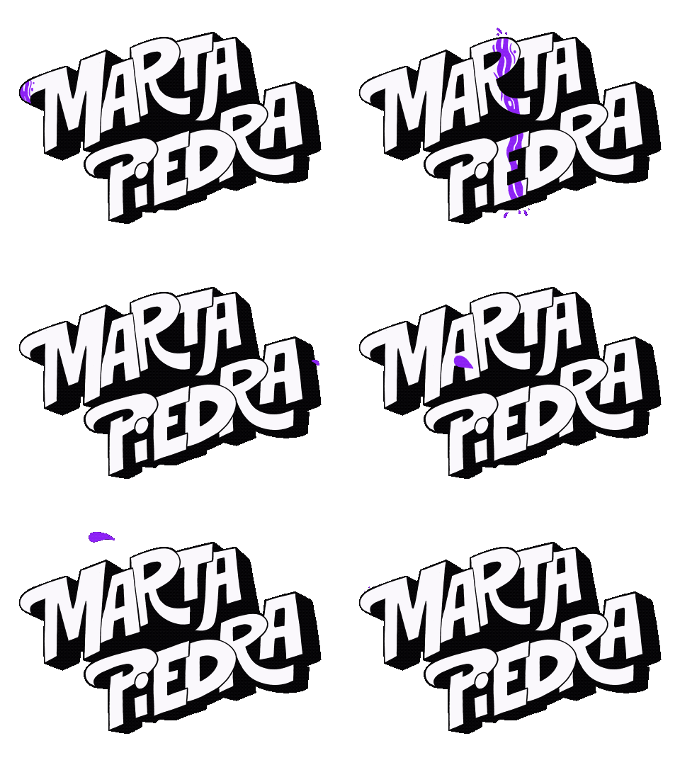
Navigating challenges was part of the creative odyssey. Translating the wine’s vibrancy into visual elements required ingenuity, especially in customizing typography that balanced uniqueness with readability.
The final masterpiece speaks volumes—a celebration of Vi Novell’s essence with every stroke and hue. It’s more than a label; it’s a story woven with creativity and a deep passion for capturing the essence of a truly exceptional wine.
Thank you for accompanying me on this design journey. I hope you find my custom typeface design as inspiring as I found creating it!
If you want to participate, check all the info here: https://cellermasroig.com/es/concurso-vi-novell/
See the whole Project here.
If you need a thoughtful and special design for your business, you’re in the right place. Write to me, and let’s talk.