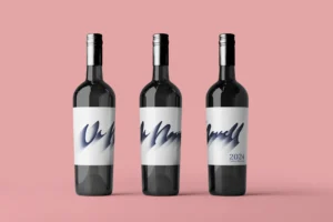
Design Concept
My design is based on the art of lettering, combining two typographic styles that represent the duality of Vi Novell: tradition and modernity. The main typography is modern, sans-serif, offering a clean and contemporary look, surrounded by flourishes that add a touch of elegance and reference its traditional heritage.
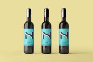
Central Element: The ‘N’ of Novell
The central element of the design is the letter ‘N’ of “Novell,” which appears pixelated to add a modern and digital touch. This detail symbolizes how Vi Novell is a blend of the classic and the modern, respecting its heritage while adapting to current times.
Stroke Style and Symbolism
The stroke style is clean but not digital, clearly showing that it is handmade. This reflects the artisanal character of Vi Novell, a wine that, although modern, maintains a strong connection to tradition and authenticity.
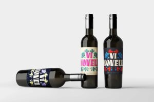
Color Palette
I have chosen a color palette that includes white, black, orange, and yellow. Each color has a special meaning:
– White and Black: Represent simplicity and elegance, as well as the balance between the traditional and the modern.
– Orange and Yellow:Evoke the warmth, energy, and vibrancy of Vi Novell, as well as the fruity and candy notes present on the palate.
Typography and Composition
The composition of the design mixes a modern, sans-serif typography with elegant flourishes, creating a dynamic and attractive visual contrast. The choice of the pixelated letter for the central ‘N’ adds an element of surprise and modernity, highlighting the innovation of Vi Novell.
If you want to participate, check all the info here: https://cellermasroig.com/es/concurso-vi-novell/
See the whole Project here.