Finding the Ideal Cover: 5 Concepts for a Middle Grade Series
When developing the cover for this publishing project, my goal was to create a strong image that would instantly connect with a middle grade audience and convey a sense of adventure, magic, and excitement. I explored five different concepts, each with its own visual narrative. Here’s the breakdown that helped me define the final direction:
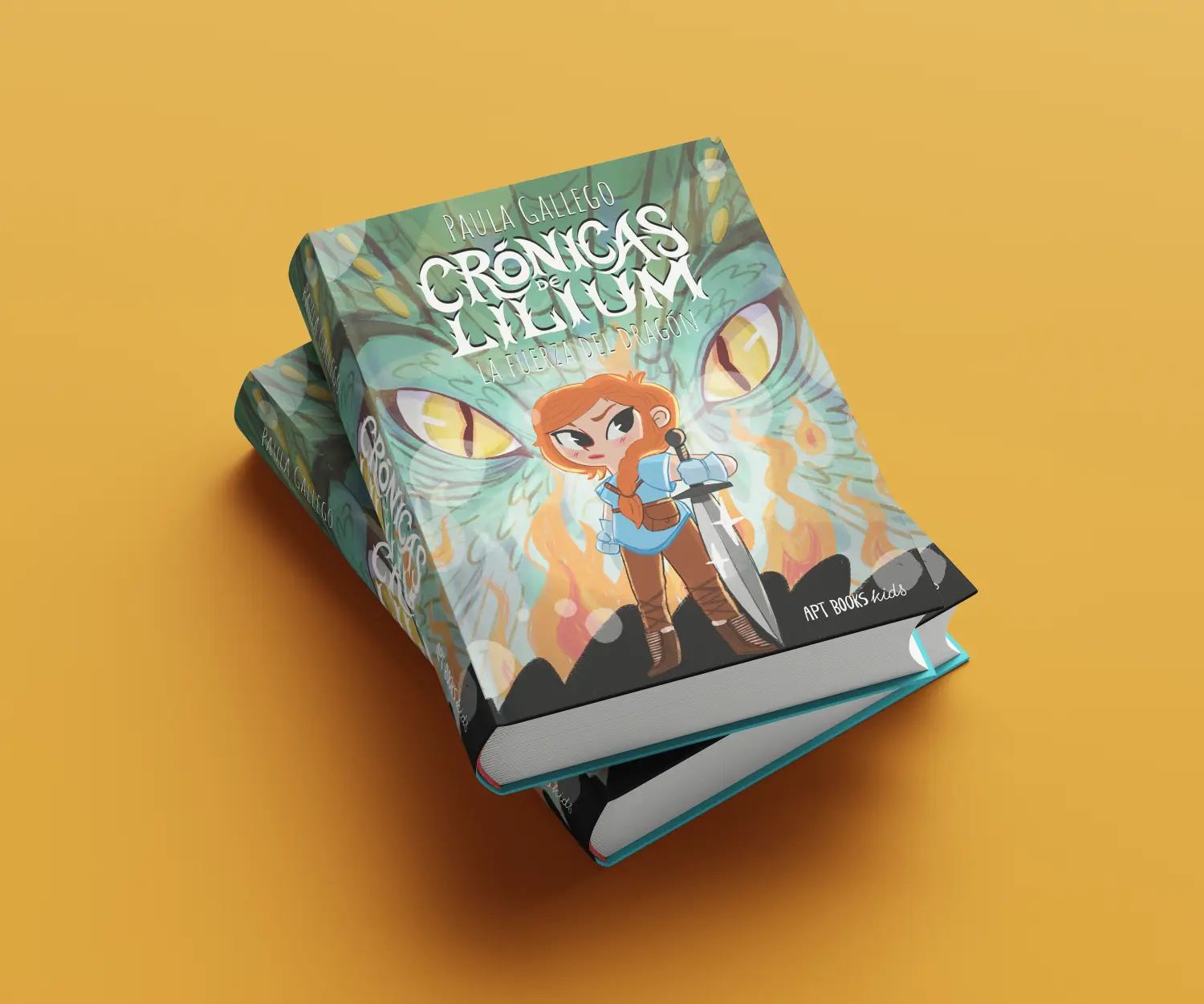
Option 1 – Frontal character with dragon eyes in the background
A direct and symmetrical composition: the character faces forward while the dragon’s eyes frame the scene from behind.
✅ Pros:
• Super clear for a middle grade audience.
• The symmetry gives it an epic, “series” vibe.
• The dragon doesn’t steal the spotlight—it reinforces the focus.
🚩 Cons:
• Quite static, with little implied storytelling.
Option 2 – Character in profile + huge dragon watching her
This one plays with a dramatic diagonal: the character looks ahead while the dragon looms above her, creating a strong visual relationship.
✅ Pros:
• Clear connection, almost a sense of complicity between the two.
• Diagonal composition adds tension and visual interest.
🚩 Cons:
• The dragon’s shape might lose impact at small sizes—it’ll depend on color and texture.
Option 3 – Giant dragon facing a tiny character
A very cinematic concept. The scale contrast delivers instant visual punch.
✅ Pros:
• Conveys adventure, mystery, and a hint of danger.
• The composition speaks for itself with strong visual impact.
🚩 Cons:
• The character appears very small, making it harder to connect emotionally.
Option 4 – Calm moment between character and dragon, almost companions
This one explores a gentler relationship, perfect for a fantasy friendship story.
✅ Pros:
• Very sweet, more of a classic middle grade tone.
• It’s immediately clear that the relationship is important.
🚩 Cons:
• A bit soft for a first book cover—feels more like “chapter two.”
Option 5 – Close-up of character in action + dragon eyes
An intense, dynamic proposal: the character is in motion while the dragon’s eyes add atmosphere in the background.
✅ Pros:
• Clear action, the character feels powerful.
• The dragon adds mood without overpowering.
🚩 Cons:
• Could become visually cluttered if not carefully balanced (eyes, hair, sword…).
🔍 Conclusion
After reviewing all the options, I chose to move forward with Option 1.
It had the best of both worlds:
• Strong visual and commercial appeal.
• A sense of fantasy series energy with a touch of ornament and mystery—just right for the story’s universe.