Recently, I had the pleasure of working on an exciting lettering project for Penguin Random House. This commission came from Lourdes, a designer in the children’s and youth division, who contacted me to create the custom lettering logo for a new collection aimed at girls over 9 years old.
About the Collection
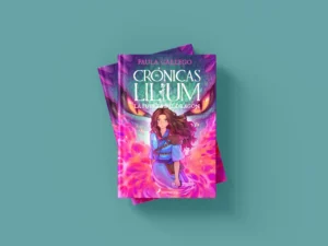
The collection, titled “SECRETO DE BRUJA” (Witch’s Secret), follows the adventures of three friends who possess magical powers and use them in their daily lives at school. This project is particularly significant because it combines elements of fantasy and friendship, capturing the imagination of the young audience.
The Commission
The main objective was to design lettering that reflected the magical and youthful essence of the collection. Starting from some initial ideas provided by the design team at Penguin Random House, I developed a lettering piece that integrates perfectly with the cover illustrations, which include textured elements and details like an illustrated frame that may feature stamping or glitter.
Creative Process
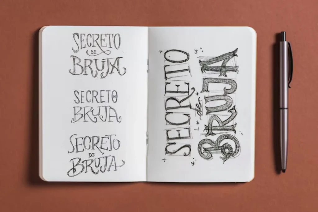
1. Inspiration and Initial Sketches:
I used references and styles suggested by the design team to start sketching various lettering options.
I´ve made 7 different ways to approach the needs of the project.
2. Typographic Development:
I focused on creating a typographic piece that would work as a distinctive brand, suitable for the target audience.
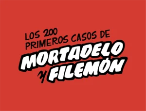
The Penguin Random House team finally chose this design.
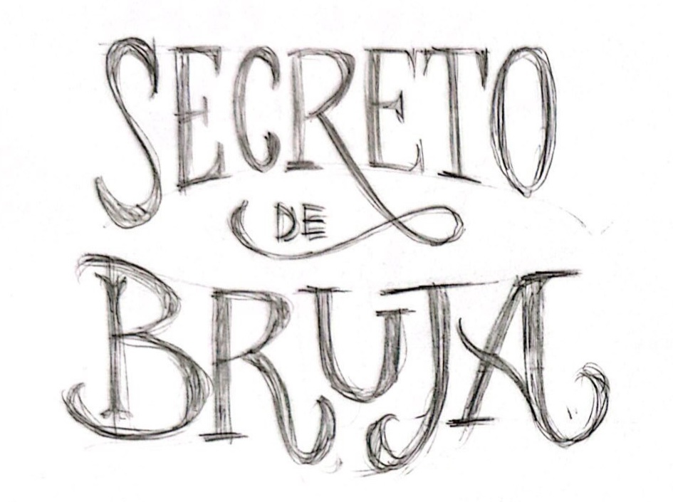
2. Typographic Development:
I focused on creating a typographic piece that would work as a distinctive brand, suitable for the target audience. So I worked on refining the final skecth. I’ve created this two options-
The PRH team choose this one but I had to adjust the tail of the R.
4. Catalan Adaptation:
At this point we needed to adapt the lettering to Catalan language (resulting in “SECRET DE BRUIXA.”).
It was challenging because I had to placed 2 letters in the space of one letter.
She asked me to try to maintain the size, proportions and the general appearance as much as in Spanish version. So I’ve have to condensed the I and the X and sent this option to her.
Finally we were agree that we loose legibility and it looked like kind of weird composition with the X and the I and we did loose the little star at the top of the I too. So we took a step back and choose the first one.
5. Digitization
Because the idea for the lettering is to be used in stamping, having it in vector format would ensure that and if the communications or marketing teams want to create posters or any promotional material, they won’t be limited.
Not so much to explain about this process but i love bezier curves and I want to show you this beautiful image 🙂
The Final Result
The result is a lettering piece that encapsulates the magic and adventure of “SECRETO DE BRUJA,” providing an attractive and cohesive visual element that complements the narrative and art of the collection.
I am very proud to have contributed to this project and to see it come to life in the hands of its young readers.
This project will see the light in march 2025, so stay tuned! 🙂
Take a look at what Lourdes said about my work
"Marta's work is exceptional. Her letterings are fresh and perfectly align with the briefing and its needs. Creative, quick, and highly professional while being a delightful person. Without a doubt, we will continue working together for a long time!"
"El trabajo de Marta es excepcional. Sus letterings tienen mucha frescura y a la vez conectan a la perfección con el briefing y sus necesidades. Creativa, rápida, muy profesional y a la vez que un encanto de persona. Sin duda, vamos a seguir trabajando por mucho tiempo!"
Lettering Project: "SECRETO DE BRUJA" for Penguin Random House
Client: Penguin Random House
AD: Lourdes Bigorra
Illustration: Raquel Travé
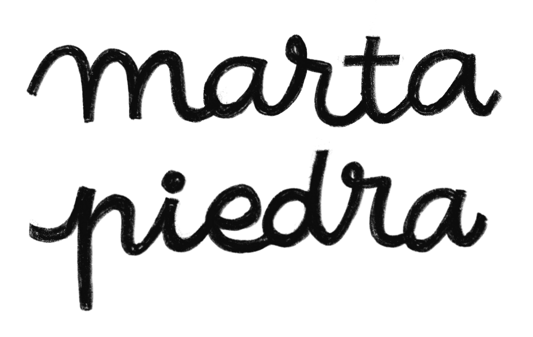
Lettering: Marta Piedra
Recently, I had the pleasure of working on an exciting lettering project for Penguin Random House. This commission came from Lourdes, a designer in the children’s and youth division, who contacted me to create the custom lettering logo for a new collection aimed at girls over 9 years old.
About the Collection
The collection, titled “SECRETO DE BRUJA” (Witch’s Secret), follows the adventures of three friends who possess magical powers and use them in their daily lives at school. This project is particularly significant because it combines elements of fantasy and friendship, capturing the imagination of the young audience.
The Commission
The main objective was to design lettering that reflected the magical and youthful essence of the collection. Starting from some initial ideas provided by the design team at Penguin Random House, I developed a lettering piece that integrates perfectly with the cover illustrations, which include textured elements and details like an illustrated frame that may feature stamping or glitter.
Creative Process
1. Inspiration and Initial Sketches:
I used references and styles suggested by the design team to start sketching various lettering options.
I´ve made 7 different ways to approach the needs of the project.
2. Typographic Development:
I focused on creating a typographic piece that would work as a distinctive brand, suitable for the target audience.
The Penguin Random House team finally chose this design.
2. Typographic Development:
I focused on creating a typographic piece that would work as a distinctive brand, suitable for the target audience. So I worked on refining the final skecth. I’ve created this two options-
The PRH team choose this one but I had to adjust the tail of the R.
4. Catalan Adaptation:
At this point we needed to adapt the lettering to Catalan language (resulting in “SECRET DE BRUIXA.”).
It was challenging because I had to placed 2 letters in the space of one letter.
She asked me to try to maintain the size, proportions and the general appearance as much as in Spanish version. So I’ve have to condensed the I and the X and sent this option to her.
Finally we were agree that we loose legibility and it looked like kind of weird composition with the X and the I and we did loose the little star at the top of the I too. So we took a step back and choose the first one.
5. Digitization
Because the idea for the lettering is to be used in stamping, having it in vector format would ensure that and if the communications or marketing teams want to create posters or any promotional material, they won’t be limited.
Not so much to explain about this process but i love bezier curves and I want to show you this beautiful image 🙂
The Final Result
The result is a lettering piece that encapsulates the magic and adventure of “SECRETO DE BRUJA,” providing an attractive and cohesive visual element that complements the narrative and art of the collection.
I am very proud to have contributed to this project and to see it come to life in the hands of its young readers.
This project will see the light in march 2025, so stay tuned! 🙂
Take a look at what Lourdes said about my work
"Marta's work is exceptional. Her letterings are fresh and perfectly align with the briefing and its needs. Creative, quick, and highly professional while being a delightful person. Without a doubt, we will continue working together for a long time!"
"El trabajo de Marta es excepcional. Sus letterings tienen mucha frescura y a la vez conectan a la perfección con el briefing y sus necesidades. Creativa, rápida, muy profesional y a la vez que un encanto de persona. Sin duda, vamos a seguir trabajando por mucho tiempo!"