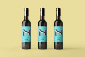
I’m excited to share with you the creative journey behind the custom typeface design for the Vi Novell label by Celler Mas Roig. This project has been a source of inspiration and innovation, and I’m thrilled to unveil the final result.
Understanding the Briefing:
From the outset, I delved deep into the briefing provided by Celler Mas Roig. My goal was to encapsulate the essence of Vi Novell, blending its freshness and tradition with a touch of modernity and originality. The challenge was to create a design that not only reflected the spirit of the wine but also stood out on the shelf.
Crafting the Concept:
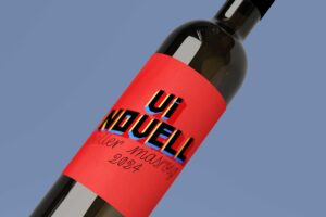
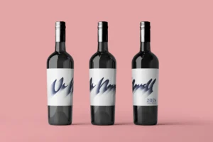
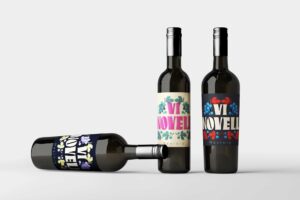
My approach centered around the creation of a custom typeface that would serve as the cornerstone of the design. I aimed to develop letterforms that were unique, dynamic, and reflective of the Vi Novell brand identity. Each stroke was meticulously crafted to convey a sense of energy and vitality, mirroring the characteristics of the wine itself.
Inspiration from Art Deco:
Inspired by the Art Deco movement, which emerged in the 1920s and 1930s, I incorporated elements of this modern and geometric aesthetic into the design. Art Deco, with its emphasis on geometric shapes, straight lines, and elegant forms, provided the perfect blend of tradition and modernity. This style embodies a futuristic and streamlined look, which aligns well with the innovative spirit of Vi Novell. The bold, sans serif typefaces typical of Art Deco offer a sense of simplicity and readability that complements the clean, fresh profile of the wine.
Adding a Modern and Rebellious Touch:
To give the design a contemporary and rebellious twist, I softened the sharp angles typical of traditional Art Deco typography. This subtle modification modernizes the classic style and adds a touch of playfulness and innovation, which is reflective of Vi Novell’s fresh and dynamic nature. The result is a typeface that feels both timeless and current, capturing the essence of a wine that celebrates both its heritage and its forward-looking approach.
My custom typeface design for the Vi Novell label is a testament to the spirit of innovation and creativity. It is a reflection of the rich tradition and heritage of Celler Mas Roig, while also embracing the excitement of the new. I am confident that this design will captivate consumers and serve as a fitting representation of the exceptional wine within.
Thank you for accompanying me on this design journey. I hope you find my custom typeface design as inspiring as I found creating it!
If you want to participate, check all the info here: https://cellermasroig.com/es/concurso-vi-novell/
See the whole Project here.