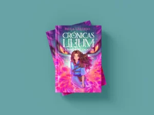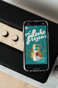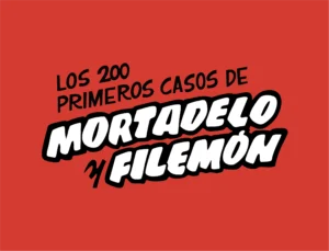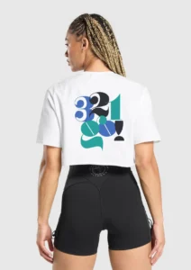
The lettering is bold and organic, capturing the vivacious spirit of Vi Novell. The modern sans-serif handmade typo adds a contemporary touch, while the playful, exaggerated letter forms add a sense of fun and celebration.
The letters are placed against a vibrant, multi-colored background, making the design pop and ensuring it catches the eye. This reflects Vi Novell’s fresh and lively character.
The background colors, which include a mix of yellow, black, and other vibrant hues, further enhance the label’s dynamic and festive appeal. Each color palette variation—red/grey, yellow/green, and green/red—adds a unique twist, ensuring the label remains visually engaging and versatile.
By combining bold, playful and dynamic lettering with a vibrant color palette, the label captures the spirit of Vi Novell—fresh, dynamic, and deeply rooted in tradition. Each element of the design is carefully crafted to reflect the wine’s unique character and make it stand out on the shelf.
Thank you for accompanying me on this design journey. I hope you find my custom typeface design as inspiring as I found creating it!
If you want to participate, check all the info here: https://cellermasroig.com/es/concurso-vi-novell/
See the whole Project here.
If you need a thoughtful and special design for your business, you’re in the right place. Write to me, and let’s talk.
