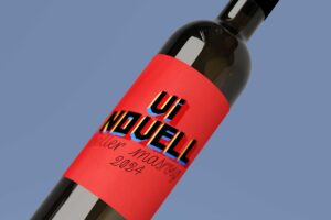
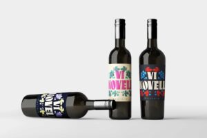
Label Design for Vi Novell from Celler Masroig (VIII)
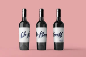
This time we immersed ourselves in the essence of typical bar chalkboards, where simplicity and authenticity come together to create a memorable experience. Thus, my proposal becomes a tribute to that rustic yet modern charm, where the name of the wine and the winery stand out elegantly against a background that evokes the warmth of those shared moments around a good glass.
Every stroke, every curve, is imbued with a passion for wine and the art of design. Because we understand that a good label not only communicates but also transports the consumer to a world of sensations and emotions.
So let’s toast to this label that speaks not only of wine but also of shared stories and unforgettable moments.
Cheers!
Thank you for accompanying me on this design journey. I hope you find my custom typeface design as inspiring as I found creating it!
If you want to participate, check all the info here: https://cellermasroig.com/es/concurso-vi-novell/